The Geometry Behind Modern UI: Squircles, Apple, and Today’s Framer Update
Blog
Listen to this article
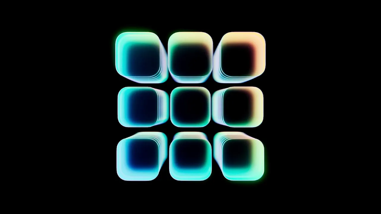
If you’ve designed long enough, you know how tiny decisions end up shaping the whole product. The kind of details nobody mentions, but everyone feels. Today Framer rolled out native support for squircles, and honestly, it was about time. Apple has been using this shape everywhere for more than a decade, quietly building an entire visual language around it.
It’s not just a cute corner style. It affects how an interface reads, how it flows, and how “finished” it feels. And now that Framer supports it out of the box, the shape has officially graduated from niche geometry to modern UI standard.
So, what exactly is a squircle?
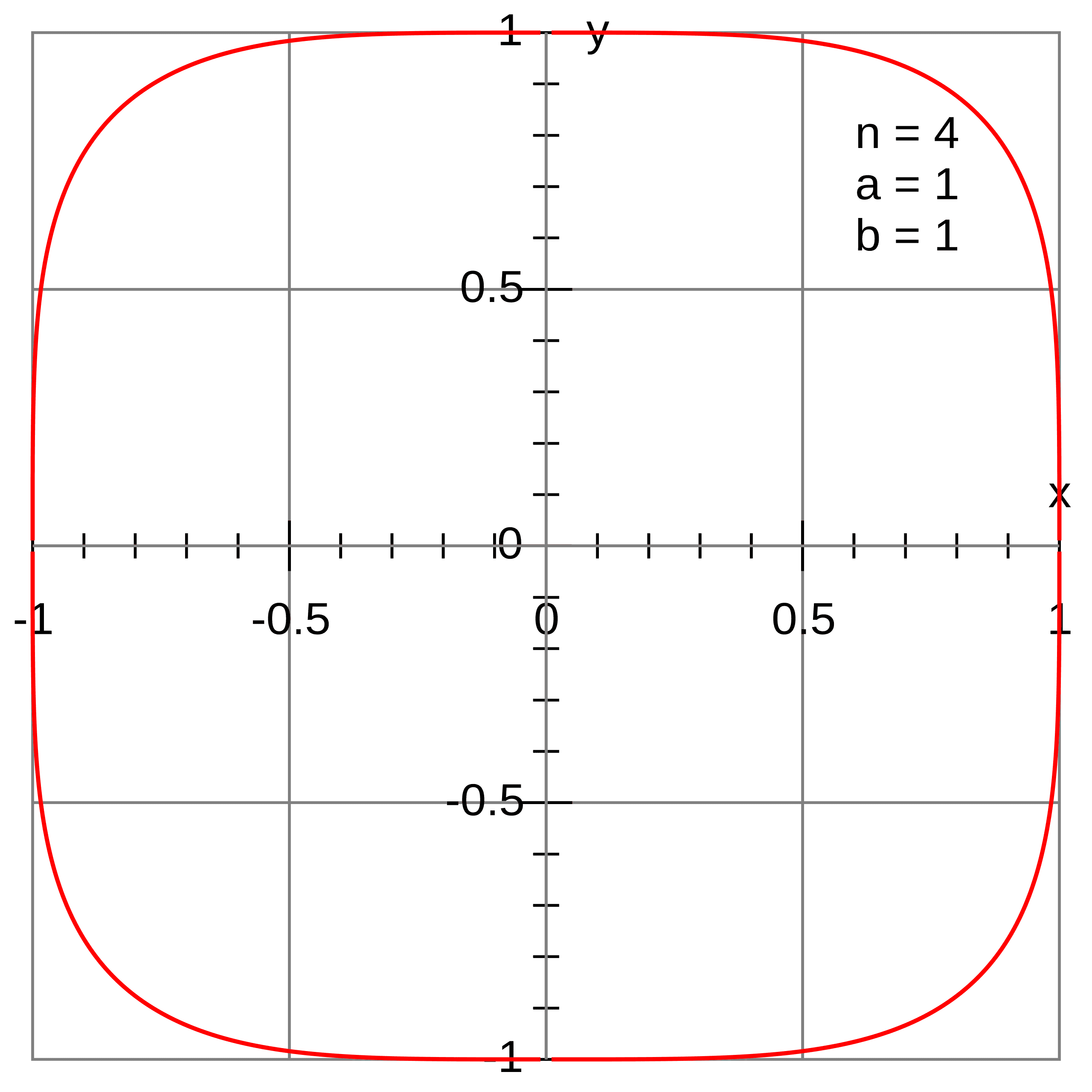
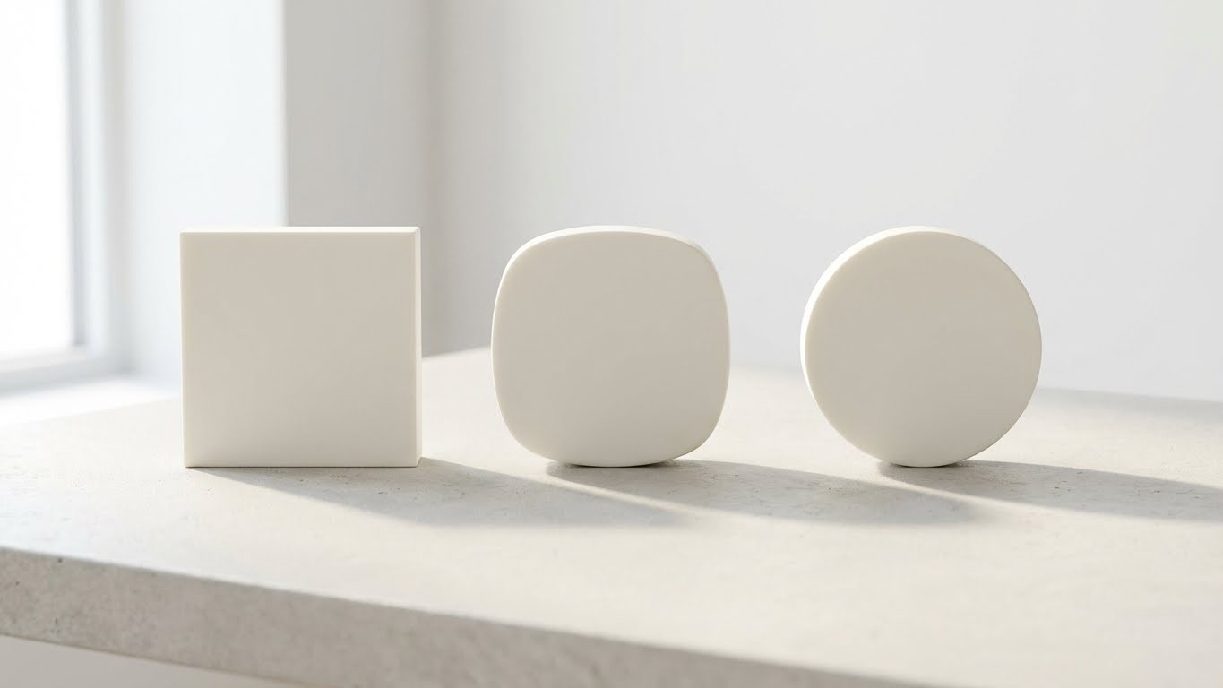
A squircle is a superellipse. Not a circle. Not a rectangle with rounded corners. Something in between. The curve stays smooth all the way around, but it holds a bit more “weight” in the corners. If you tried sketching it by hand, it’s probably what you’d draw instinctively.
It feels softer than a typical radius and less mechanical than a perfect circle. That balance is why it works so well. It looks intentional without calling attention to itself.
Apple figured this out ages ago
Apple never made a big announcement like “We’re switching to superellipses for everything.” They just did it.
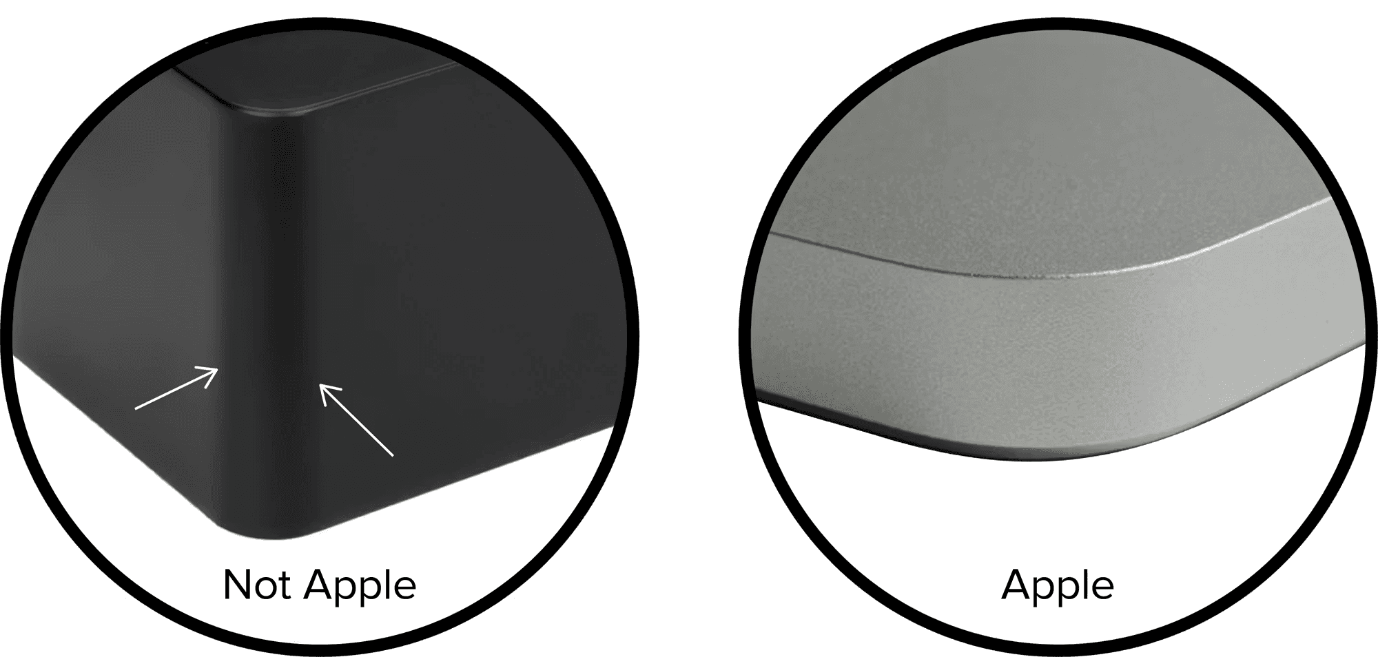
iOS icons, since iOS 7, follow a squircle grid
Apple Park’s footprint is a giant superellipse
Apple Watch hardware echoes the same curve
Even system buttons and cards borrow the same logic
This is why Apple’s ecosystem looks consistent even when the styles change. The curve acts as the glue. Hardware and software share a common “visual gravity.”
Meanwhile the rest of us were throwing around border-radius: 8px like it solved everything.
Framer finally brought it home
With today’s update, Framer lets you drop squircles into your components without hacks, SVG masks, or weird frame tricks. It’s clean, native, and works inside the visual editor.
For anyone who has spent too much time fighting with shape consistency in design systems, this is a breath of fresh air. One less custom asset to maintain. One less “why does this corner feel off” moment.
And, honestly, this update says something about where UI is heading. When a mainstream tool embraces a shape like this, it means users already expect interfaces to feel slightly more organic.
See today's update: https://www.framer.com/updates/december-update-2025
But you don’t need Framer to use squircles
If you’re building for the web, you’ve been able to do it for years. It’s just not sitting in a dropdown.
Here’s the simple version using clip-path with a path you generate:
There are plenty of superellipse generators out there. You drop in your radius, copy the path, and you’re set.
If you want something less precise but fast, you can cheat a bit:
Not perfect, but when you just need the vibe, this works surprisingly well.
Why this shape matters more than you think
Corners influence how people process density, hierarchy, and comfort.
Hard corners feel strict. Sharp. Functional.
Perfect circles feel playful, sometimes too playful.
Squircles sit right in the sweet spot. Soft, but still structured.
They reduce the visual “bite” of UI elements without turning everything into a toy. In dashboards, they help the layout breathe. In branded products, they add a subtle signature. In mobile, they match the physical ergonomics we’re already used to.
These are small shifts, but they add up fast.
Should you start using squircles everywhere?
Probably not. Like any stylistic choice, it works best when it has a purpose.
Try them on:
Buttons that need a softer entry point
Cards with lots of white space
Avatars or thumbnails
Key components in your design system
Skip them for:
Large modals
Dense tables
Anything that needs strict structure
Use them intentionally. Not because they’re trendy, but because the screen needs it.
If you want to try it today
In Framer, just pick the new shape.
In CSS, use clip-path or percentage-based radii.
In Figma, plugins can generate true superellipses for you.
Start small. Replace one card or one button. You’ll see the difference. These micro-tweaks are what separate a page that “works” from a page that feels designed.
Looking for Someone Who Can Do This on Your Team?
I write these breakdowns because it's what I do: find the real bottlenecks (not the obvious ones) and fix them with data.
If your team needs someone who can:
Diagnose conversion problems with data, not opinions
Ship fixes with measurable impact in 30-60 days
Move between strategy, analysis, and execution
Let's talk.

Josue Somarribas
Product Designer especializado en conversión y crecimiento
Contact