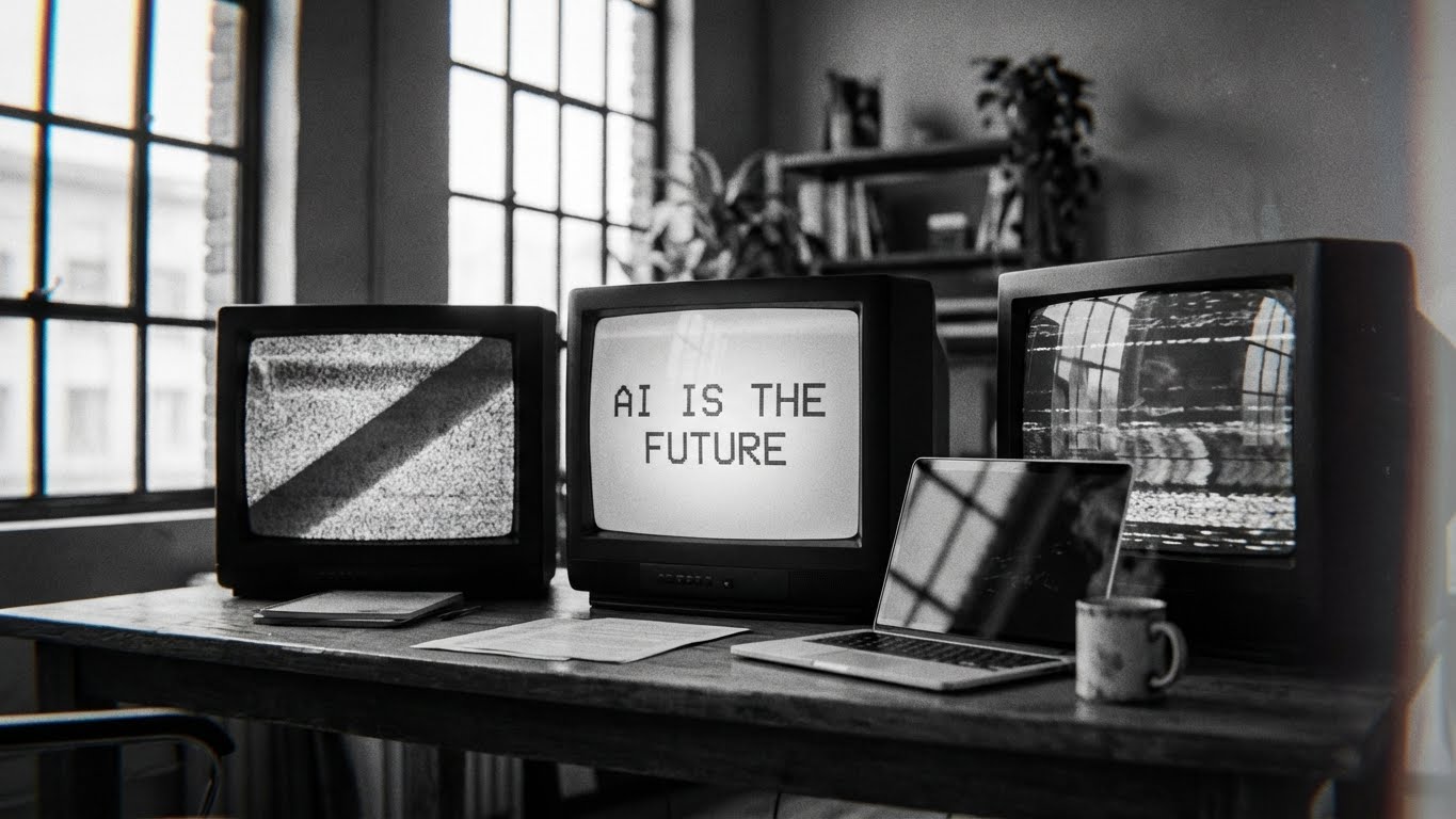
AI-Assisted UI Design: Faster, Yes. Better, Not Always.
Blog

There’s a strange moment happening in UI design right now. Every major tool wants to convince us that the future is frictionless. Need a layout? Figma AI will sketch it out in seconds. Want a dashboard from a napkin doodle? Uizard has you covered. Need a dozen “on-brand” hero images before lunch? Firefly can pump them out like a vending machine.
It’s easy to see the appeal. Most of us are drowning in deadlines, design reviews, and the classic “quick update before the sprint closes.” Speed sounds like salvation.
But after using these tools in real projects, I’ve learned something simple. AI makes the work faster, yes, but speed doesn’t guarantee better design decisions. And sometimes the speed hides problems instead of solving them.
A recent study on AI in UI/UX backs this up. Obanya (2025) found that while tools like Figma AI, Uizard, and Firefly boost efficiency, they also introduce homogenization, reduce creative autonomy, and often break contextual awareness when it matters most.
That last one is the real kicker. Context is everything in design, and AI still struggles badly with it.
Faster Output Is Not the Same as Better Design
One thing AI does brilliantly is remove the boring parts of the job. Renaming layers. Generating placeholder copy. Spinning up a first draft of a wireframe. If UI design were a kitchen, AI is the sous-chef who chops everything before you arrive.
But here’s the catch. Speed often tempts teams to skip the thinking part. You can generate five variations of a signup flow in a minute… and still have five flows that ignore the real mental model of the user. AI gives you shapes, but not necessarily sense.
Obanya points out that designers equate this acceleration with improvement, even though the underlying decisions haven’t changed. The AI didn’t magically understand the business model, the user constraints, or the messy politics inside an organization. It just produced screens. Fast.
Where AI Helps (and Where It Misleads)
Figma AI

Shines:
Cleaning up layout rules when your frame looks like it just survived a small earthquake.
Generating lightweight copy to unblock early wireframes.
Turning a rough prompt into a starting point.
Misleads:
It confidently proposes UI patterns that ignore accessibility heuristics or platform norms.
It tends to default to the same visual styles, even when a product needs something opinionated.
Uizard

Shines:
Fast MVPs.
Quick idea translation from sketches into something clickable.
Getting non-designers into the conversation early, which honestly helps alignment.
Misleads:
It flattens complexity. Everything becomes a wireframe, even when the problem isn’t layout but logic.
It erases nuance between use cases because it maps patterns, not intentions.
The auto-generated components often lack UX depth. They’re more “screens” than “solutions.”
Obanya’s study noticed this repeatedly in real-world case work.
Adobe Firefly

Shines:
Branding explorations at high speed.
Photography alternatives without scheduling a photographer.
Concept moodboards that help teams define a tone early.
Misleads:
High aesthetic output creates a false sense of completeness.
It produces visuals that sometimes contradict the product’s purpose or accessibility requirements.
It risks overfitting to whatever style is trending in its training data.
The Hidden Problem: Homogenization
This is the quiet side-effect people don’t want to admit. AI tools learn from existing patterns and, as a result, they reinforce them. Obanya calls this out as one of the biggest risks: designs start to look the same. Buttons, cards, hero layouts, even form structures begin to merge into a single global template.
You’ve probably seen this already. A new app launches and you swear you’ve seen the UI before. You have. We all have.
Homogenization isn’t just boring. It kills innovation. It narrows the design conversation to “what’s already out there” instead of “what should exist for our users.”
AI Breaks Context More Often Than You Think
The core of good UI/UX is context. Who is the user, how do they behave, what constraints matter, and what tradeoffs are acceptable?
AI doesn’t understand any of that. It fakes understanding through pattern assembly.
Give it a task flow and it might propose a solution that contradicts the actual mental model your audience uses. This is particularly risky when designing for accessibility, where contextual cues matter deeply. Adaptive UI research shows that users with different disabilities rely on different navigation and sensory patterns that AI often overlooks.
This isn’t a small problem. It’s foundational.
A Small Real-World Example
A few months ago, I prototyped a new onboarding flow for a client. Before touching Figma, I ran a short user test with a paper sketch. One participant pointed out a subtle trust issue in the first step. Something only a human would notice: the tone in the copy created uncertainty in a moment that required reassurance.
Later, I asked Figma AI to rewrite the copy “in a friendly yet concise tone.” It responded with something polished, smooth, and completely wrong for our audience. It sounded like a landing page for a fintech app that wanted you to relax while you handed over your savings.
AI helped me speed up the alternatives, but it didn’t help me make the right decision. The right decision came from a five-minute conversation with an actual user.
That’s the part AI cannot automate.
Reduced Creativity and Algorithmic Bias
Obanya’s research showed that designers feel less creative when relying too heavily on AI suggestions. Screens start to feel predictable, and the tool quietly nudges you toward the same safe patterns. It’s the equivalent of designing with training wheels on — comfortable, but limiting.
Then there’s bias. Algorithms often produce layouts or language patterns that reflect the biases in their training data. In UI/UX, this shows up as:
Forms that assume Western naming conventions.
Imagery that defaults to narrow demographics.
Interaction patterns that overlook accessibility needs.
Again, as the accessibility research reminds us, users have different mental models and constraints. When AI ignores those, the design breaks.
So How Should Designers Use AI?
Use it the way a seasoned chef uses a blender. Helpful, fast, and great for bulk work. But no one confuses the blender with the cook.
AI is a fast assistant, not a creative replacement.
Here’s the mindset that works:
Let AI handle the repetitive parts of the job.
Let AI generate options, not decisions.
Let AI propose, but validate everything with real users.
Keep your process grounded in human judgment.
Keep your craft sharp, because the tools won’t think for you.
The designers who thrive in this era aren’t the ones producing screens the fastest. They’re the ones who know when to slow down, question a suggestion, and make choices based on context, not convenience.
That’s the part of UI/UX that’s still very human. And thankfully, it’s also the part that makes the work worth doing.
Looking for Someone Who Can Do This on Your Team?
I write these breakdowns because it's what I do: find the real bottlenecks (not the obvious ones) and fix them with data.
If your team needs someone who can:
Diagnose conversion problems with data, not opinions
Ship fixes with measurable impact in 30-60 days
Move between strategy, analysis, and execution
Let's talk.

Josue Somarribas
Product Designer especializado en conversión y crecimiento
Contact