What “Accessible Enough” Really Means in 2025
Blog
Most teams still talk about accessibility as if it were a binary switch, something that either “passes WCAG” or doesn’t. The reality in 2025 feels closer to a sliding scale, where a product can be technically compliant yet still frustrating, confusing, or downright unusable for a big part of your audience. I’ve seen teams celebrate because they hit the contrast ratios while the layout collapses into chaos on smaller screens. I’ve also seen products that score well on automated audits yet leave users with disabilities relying on guesswork to complete a task. Passing a checklist isn’t the same as being accessible.
“Accessibility isn’t something you add. It’s something you build.”
The pressure is growing. New regulations, especially the European Accessibility Act, are pushing companies to treat accessibility as something baked into the experience, not bolted on at the end. The EAA expects products to support foreseeable use by people with disabilities, which is a polite way of saying: don’t hide behind excuses when something is clearly hard to use. Compliance is no longer enough. Intent matters.
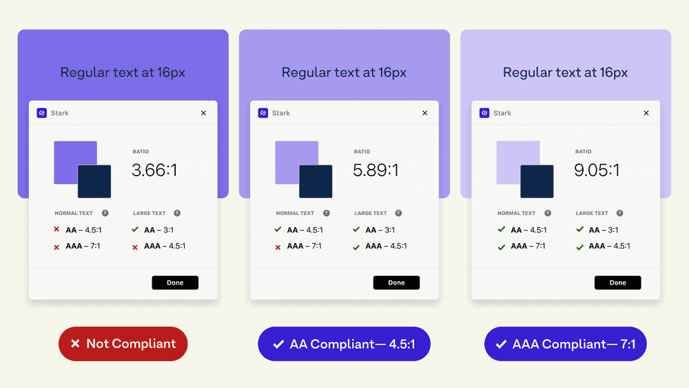
— Accessible contrast ratios and A-levels explained
So what does “accessible enough” look like today? It starts with the basics, sure, but the basics aren’t enough. Contrast isn’t just a ratio on a spreadsheet. It’s whether someone can read something in bright sunlight on a small phone. I’ve watched perfectly “legal” contrast ratios fall apart the moment real life enters the picture. Designers tend to optimize for the device on their desk, not the one in a crowded bus or with a cracked screen.
Hierarchy is another one of those areas where teams think they’re safe because the layout “looks clean.” But hierarchy isn’t a visual preference. It’s a cognitive aid. It tells people what matters, what connects, and what comes next. When hierarchy collapses, your accessibility story collapses with it because attention and comprehension rely on structure.
“The power of the Web is in its universality. Access by everyone regardless of disability is an essential aspect.”
Modern accessibility also expects interfaces to adapt instead of forcing users to do all the adapting. People bring different contexts, limitations, and mental models. Someone may rely on a screen reader, someone else on enlarged text, and someone else on predictable navigation because remembering complex flows is hard. Accessibility today means reducing the cognitive burden, not adding more of it. Clear instructions. Consistent wording. A sense of “I know what comes next.”
There’s another uncomfortable truth. Many interfaces fail not because they lack features but because they assume everyone thinks like the designer. Mental models vary wildly. If your interface depends too much on clever gestures, ambiguous icons, or buried functionality, you’re essentially asking users to adopt your way of thinking. That’s not accessibility. That’s wishful thinking. And it’s the kind of thinking that often breaks first for users with disabilities.
“Accessible enough” in 2025 means stepping beyond compliance. It’s not about chasing perfection. It’s about acknowledging that accessibility is not a checkbox but an ongoing negotiation between what the system offers and what the user needs. A site can look gorgeous, pass Lighthouse, and still alienate people. Meanwhile, a simpler design with clearer hierarchy and adaptive cues often succeeds where the polished one fails.
If we treat accessibility as a living part of the product, not a requirement to survive an audit, the experience improves for everyone. Faster comprehension. Lower bounce rates. More trust. Better business results, sure, but also a better product—one that respects the simple truth that not everyone approaches a screen the same way.
Looking for Someone Who Can Do This on Your Team?
I write these breakdowns because it's what I do: find the real bottlenecks (not the obvious ones) and fix them with data.
If your team needs someone who can:
Diagnose conversion problems with data, not opinions
Ship fixes with measurable impact in 30-60 days
Move between strategy, analysis, and execution
Let's talk.

Josue Somarribas
Product Designer especializado en conversión y crecimiento
Contact